1. Outline
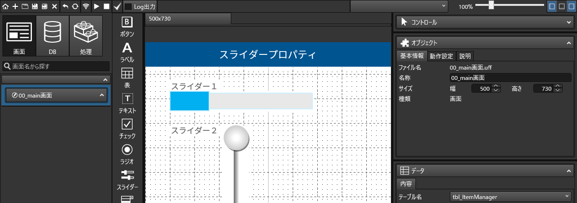
The slider is a control that smoothly changes from minimum to maximum value for a particular number.
Slider handles operate by dragging or other screen operations, or by setting numerical values through processing.
In the following, we will use the term "2. Development GuidanceYou can download sample programs for frequently used functions of the slider at3. Parameterssection provides a reference to the parameters to be set for the slider.
2. Development Guidance
We have compiled a sample project with parameter settings that are frequently used in using the slider. Please download and make use of it.
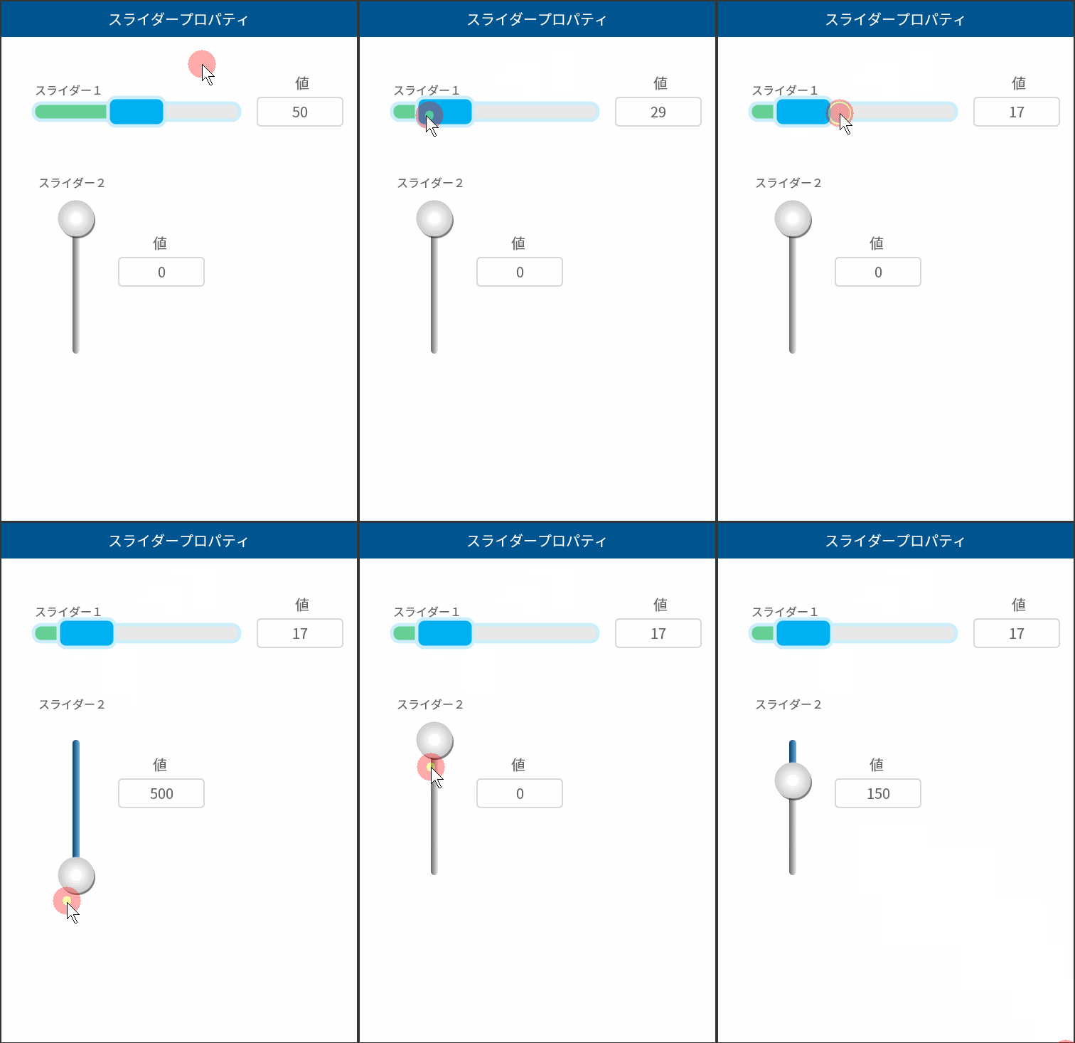
2-1. Create a horizontal rectangular slider
Create a horizontal slider.

2-1-1. Place sliders and set initial values, maximum values, etc.
Select "Slider" in the control bar and drag it on the screen to position the slider.
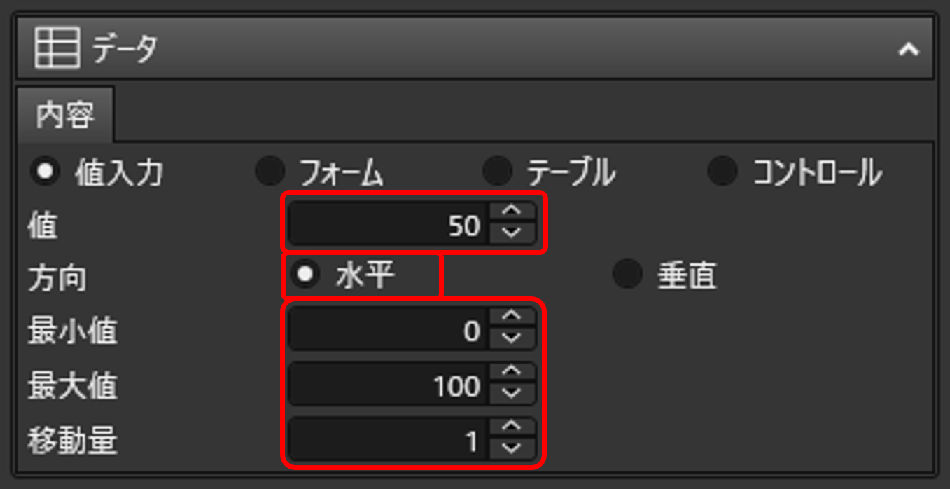
With the slider selected, set the slider in the Properties area under Data > Contents as shown below.
The setting entered in "Value" is the initial value. In the sample example, 50 is set.
Horizontal is selected under "Direction," so the slider will be horizontal.
The "minimum value" is set to 0. The value is the value when the slider knob is in the leftmost state.
The "Maximum Value" is set to 100. The value is the value when the slider knob is in the rightmost state.
The "Movement amount" is set to 1. This is the amount of movement when the slider is clicked.
In this sample example, 50 is set as the initial value for minimum 0 and maximum 100, so the knob position starts from the center.
2-1-2. Change the design
With a slider selected, you can change the design of the slider from "Design" > "Color and Shape" in the Properties area.
(1) The color of the slider knob.
(2) The color of the bar on the right side of the slider.
The color of the border of the entire slider.
(4) The color of the bar to the left of the slider.
(5) This is the thickness of the entire slider border.
(6) It will be the roundness of the corner of the slider knob.
(7) This is the thickness (thickness) of the bar on the right side of the slider.
Also, by setting "Button Type" to B, the knob becomes a rectangular slider.

2-2. Create a vertical round slider
Create a vertical slider.
2-2-1. Place sliders and set initial values, maximum values, etc.
Select "Slider" in the control bar and drag it on the screen to position the slider.
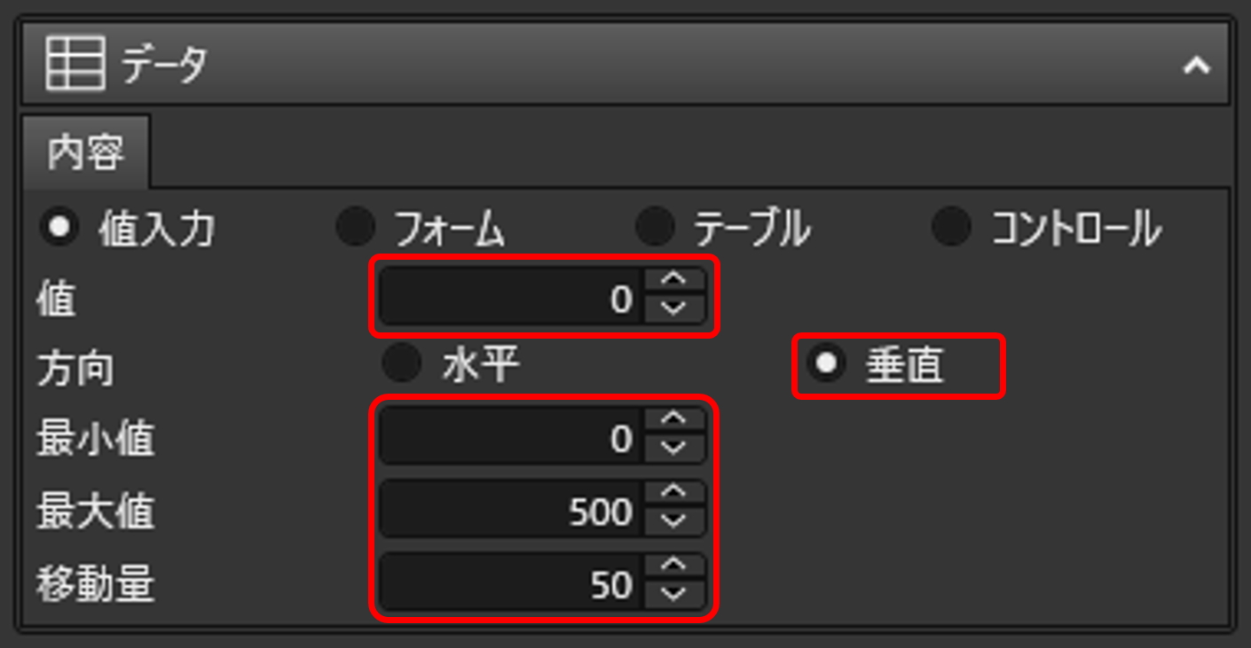
With the slider selected, set the slider in the Properties area under Data > Contents as shown below.
The setting entered in "Value" is the initial value. In the sample example, 0 is set.
Since Vertical is selected under Direction, the slider will be vertical.
The "minimum value" is set to 0. The value is the value when the slider knob is in the leftmost state.
The "Maximum Value" is set to 500. The value is the value when the slider knob is at the upper end.
The "Movement amount" is set to 50. This is the amount of movement when the slider is clicked.
In this sample example, 0 is set as the initial value for minimum 0 and maximum 500, so the position of the knob starts from the top edge.
2-2-2. Change the design
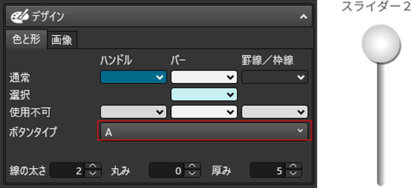
With a slider selected, you can change the slider design from "Design" > "Color and Shape" in the Properties area.
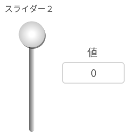
If "A" is selected for "Button Type," the slider becomes a round slider as shown in the figure below.
Note that if a Type A design is selected, all parameters except button type will be disabled.
2-3. Obtain values when moving the slider
This section shows how to use timer logic to get the value when the slider is moved.
2-3-1. Retrieving Values with Logic
Create logic to retrieve slider values.
Create a new file from the process design function and create logic as follows Please refer to the sample project, which is created under the process name "011_Get Slider Value and Draw Text.

#1 "Get Control/Contents" Get the current knob value for slider 1
#2 "Get Control/Contents" Get the current knob value for slider 2
#3 Output the results of "Control/Content Set" #1 to Text 1
#4 Output the results of "Control/Content Set" #2 to Text 2
2-3-2. Logic to repeatedly execute logic to obtain values
Create a different logic from the above and repeat the above logic.
Set up the logic as follows Please refer to the sample project, which creates a process called "010_Timer.

The logic parameter settings are as follows
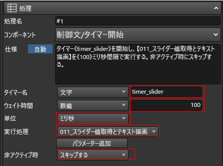
Timer name" Arbitrary name.
Logic registered in "Execution Process" is repeatedly executed at intervals of time set in "Wait Time" and "Unit. By setting "Skip" to "Inactivity", logic execution will be suspended when the application is inactive.
With the above settings, the logic created in 2-3-1 will be executed repeatedly at 100 ms intervals.
2-3-3. Registering Logic
Finally, set the timing at which the timer process itself is executed.
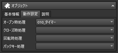
In this case, the timer is set to start when the application screen is displayed.
With the area where no controls are placed on the screen where the slider is placed selected, select "Object" > "Behavior Setting" in the Properties area, and set the timer logic created in 2-3-2 to "Processing when open.
3. Parameters
By changing the parameters, you can easily set the position and size of the slider, its color and shape, and the image to be displayed, so take advantage of them to create a well-designed, easy-to-understand screen.
You can also set the target control to make the slider a scrollbar, so that when the app user drags the handle of the slider, the configured table or subform will scroll.
object
Basic information and operation settings for sliders are set from "Objects. By making the slider inactive, it is possible to set up a slider that is only activated when the app user performs certain operations, etc.
Basic Information
| name | Name of slider. If you want the slider to have behavior from the processing logic etc. designate sliders with this name. The default is "slider + sequential numbers". |
|---|---|
| Size | The width and height of the slider can be specified in fine increments of 1 pixel. |
| position | You can specify the position of the slider. The starting point is the upper left corner of the screen. |
| margin | You can create a blank area on the slider where no text or images are displayed. Specified by the distance from the top and bottom of the slider to the left and right. |
| type | You can check the type of control. No changes can be made. |
| style | By selecting from the pre-defined styles, parameters such as colors, borders, etc. can be set. Easy to set up. |
possibility
| available | By unchecking this checkbox, the slider can be deactivated (operation disabled). Yes. Sliders installed that cannot be operated until certain conditions are met The following table shows the number of the items that can be used for the following purposes. |
|---|---|
| display | Uncheck this box to hide the slider. Certain conditions This is used, for example, when installing a slider that will not be displayed until the |
data
Settings related to the values that can be obtained by "Process/Control/Retrieve Contents" are made from "Data". In addition to direct input, values extracted from forms or databases can be set.
Contents
value entry
Set if you want to directly input the value that can be obtained from the slider.
| value | You can enter the initial value of the slider. |
|---|---|
| horizontality | Check this box if you want to use a horizontal slider. |
| vertical | Check this box if you want to use a vertical slider. |
| minimum value | Specifies the minimum value of the slider. |
| greatest value | Specifies the maximum value of the slider. |
| Amount of movement | Specifies the minimum amount of slider movement. |
form
Set if the value that can be retrieved from the slider is to be entered using a data form.
| Field Name | The table set in the form from which the data will be retrieved. Select a field (column). |
|---|---|
| available | Enable/disable the slider from the table set in the form The following is a list of the types of information that can be used for the following purposes. |
| display | Set the slider to show or hide from the table set in the form The following is a list of the types of information that can be used for the following purposes. |
| foreground | Set slider foreground color from the table set in the form The following is a list of the types of information that can be used for the following purposes. |
| background color | Set the slider's background color from the table set in the form The following is a list of the types of information that can be used for the following purposes. |
| horizontality | Check this box if you want to use a horizontal slider. |
| vertical | Check this box if you want to use a vertical slider. |
| minimum value | Specifies the minimum value of the slider. |
| greatest value | Specifies the maximum value of the slider. |
| Amount of movement | Specifies the minimum amount of slider movement. |
table
Set this if the values that can be retrieved from the slider are to be entered using a database, rather than being set in advance.
| table name | Select the table from which the data will be retrieved. |
|---|---|
| Field Name | Select the field (column) in the table from which the data will be retrieved. |
| available | Used to enable/disable the slider from the table. |
| display | Used to set the slider to show or hide from the table. |
| foreground | Used to set the slider foreground color from the table. |
| background color | Used to set the background color of the slider from the table. |
| horizontality | Check this box if you want to use a horizontal slider. |
| vertical | Check this box if you want to use a vertical slider. |
| minimum value | Specifies the minimum value of the slider. |
| greatest value | Specifies the maximum value of the slider. |
| Amount of movement | Specifies the minimum amount of slider movement. |
control
Set if the slider handles are to be used as scrollbars that scroll the selected table or subform when dragged.
| Screen Control Name | Select a table or subform placed in the screen. |
|---|---|
| horizontality | Check this box if you want the slider to be a horizontal scroll bar. |
| vertical | Check this box if you want the slider to be a vertical scroll bar. |
design
To set the color, shape, and image of the slider regardless of style, change "Design". The design of the slider can be set in detail.
Color and Shape
| normal handle (user name) | Specifies the handle color during normal operation. |
|---|---|
| Normal bar | Specifies the bar color of unselected areas during normal operation. |
| Normal ruled/box lines | Specifies the color of the ruled/framed lines during normal operation. |
| selection bar | Specifies the bar color of the selection during normal operation. |
| disabled handle | Specifies handle color when operation is disabled. |
| Unavailable Bars | Specifies the bar color when the operation is disabled. |
| Unavailable ruled lines/frames | Specifies the color of the ruled/border line when the operation is disabled. |
| Button type | Select the shape of the slider. |
| line thickness | Specifies the thickness of the line. |
| roundness | Specifies the roundness of the slider corners. |
| thickness | Specifies the thickness of the slider. |
image
| Standard Image | You can set the image that is displayed during normal operation. |
|---|---|
| Image Deletion | You can clear the standard image settings. |
| pressed image |
You can set the image that is displayed while the slider is pressed. To clear the set image, click the Delete Image button. |
| Invalid standard image | You can set the image to be displayed when the operation is disabled.
To clear the set image, click the Delete Image button. |
| invalid pressed image | You can set the image that is displayed while the slider is pressed when the operation is disabled.
To clear the set image, click the Delete Image button. |
| Image display position (vertical) | Align Top][Center Top][Center Bottom][Align Bottom] for the image display position in the slider. Select from any of the following |
| Image display position (horizontal) | Align Left][Center Left][Center Right][Align Right] for the image display position in the slider. Select from any of the following |
| Single-sided fit | Resize the image to fit inside the slider. The following is a summary of the results of the study. [no setting][inscribed fit][circumscribed fit][circumscribed fit][horizontal and vertical fit Select from any of the following. |
Change image
Single-sided fitting (example)
 |
 
|
 
|
 
|
 
|