
1. summary
Wouldn't it be sad if you develop an application for actual business use but it is never used?
UI and UX are considered important these days, but "usability" and "understandability" are equally important for internal use, and it may be difficult to penetrate the company if the system is "just a thing filled with business operations.
However, many people may be confused when suddenly asked to create a product with a focus on UI/UX.
This section is not intended to help you understand the theory of UI/UX, but rather to provide information on "how to proceed with design" that you should consider when designing apps for the Unifinity Platform.
We hope the article will help you to develop the actual application.
2. Device Considerations
Unifinity Platform runs on iOS, Android, and Windows, but it is important to sort out "what OS will be used primarily" and "what screen (portrait/landscape orientation) will the app primarily be used on". It is also necessary for device selection during actual testing, and there is a difference in development efficiency if the specificities of each OS are not grasped during development.
2.1. What is the OS?
2.1.1For Android
Consideration about navigation bar
Android displays an area called the "navigation bar" that is used to operate apps and the system.
There are two types: a three-button type and a gesture-navigation type, and users can switch between them in Android settings.
If you are developing an app that will also be used on iOS and Windows, it is best to limit the use of the navigation bar, which is an Android-specific feature, to anything other than "returning to Application Player."
Use expanding draw area option
If you're using Unifinity 6.0 or later, you have the option to extend the draw area behind the status bar and navigation bar. While this allows you to use more screen real estate, controls drawn behind the status bar, navigation bar, notch, or punch hole will be inoperable.
Do not place buttons or other controls in inoperable areas, and avoid displaying important information where a notch or punch hole might be present.
If you plan to use the device in landscape mode, you should also pay attention to the position of the navigation bar and notch.
In portrait mode, the notch is usually at the top of the screen and the navigation bar at the bottom. However, when the screen is turned sideways, the notch moves to the left or right edge of the screen.
The navigation bar's location depends on the device type and settings.
On tablets or when using the gesture navigation bar, the navigation bar is always at the bottom of the screen.
On smartphones with a three-button navigation bar, the navigation bar will be positioned where it was at the bottom in portrait mode.
 For iPhone ・・・ Consideration of notch area
The iPhone X, for example, has a design in which the camera and sensors at the top of the screen encroach into the screen.
Due to the specifications of the Unifinity Application (as of February 2020), automatic identification of notch areas encroaching on the screen cannot be performed, so consideration must be given in advance to avoid placing buttons and other items in the notch areas.
For Windows ・・・ Consideration of mouse operation, display of "Menu
However, if an application is designed to be used on Windows, the screen is wider than on an iPhone or Android device, and the mouse can be used to operate the application. However, if there are too many input items (or the appearance of too many input items), users may shy away from the application, so care should be taken.
Although it is possible to set "Hide Navigation Bar" from the properties of Unifinity Studio, it is not recommended because while it improves the appearance of the application, it does not allow the user to return to the "Application Player". It is a good idea to hide the navigation bar if it is a shared terminal in the company and there is no expectation of using other applications (e.g., using it for a stationary time and attendance terminal). note (supplementary information) symbol
*Supplementation
It is also possible to implement other methods besides using the navigation bar by introducing "exit" logic from the processing component.
The "Return to Application Player" method varies from OS to OS.
- Android ・Tap the "Back" button (left button) on the footer menu
- iOS ・・・ Tap anywhere on the screen with two fingers (a dedicated menu will appear)
- Windows ・・・ Click "Close Application" from the navigation bar
2.2. Vertical or horizontal orientation
Considerations when using the application should include not only the operating system, but also the device itself.
The primary considerations will be the use of standard mobile devices, tablets, or both.
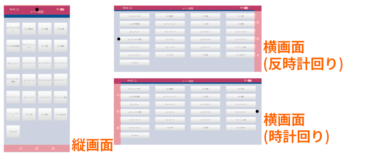
In particular, it is recommended that tablet terminals be checked in advance, as there are many scenarios in which they are used in landscape orientation, such as in combination with a Bluetooth keyboard, when placed in actual work.
Unifinity Studio allows the creation of "portrait" and "landscape" screens, but this is not recommended from the standpoint of development efficiency, as it creates double work when adding functionality later.
As much as possible, you should consider using one or the other.
Example of vertical screen layout
Example of horizontal screen layout
3. Organizing the Menu
In addition to "what to do," menus in business applications need to be organized in "what order to do it in. In addition, because of the wide variety of tasks involved, it is not uncommon to create screens as told, resulting in applications that are complicated and difficult to use.
We will explain how to consider the menu under certain "constraints" of a mobile application.
In the development of consumer apps for the general public, emphasis is placed on giving form to the abstract concept of "customer experience," and studies involving UX designers are necessary. However, if the application is for internal use, it is possible to create a suitable application by simply focusing on whether the work is organized.
Although the word "constraints" is mentioned, it is a shortcut to determine the menu layout by adopting the viewpoint of "effectively utilizing constraints to organize operations" in the development of Unifinity Platform applications.
There are numerous types of menus, but this article describes two basic types: the "bottom navigation" and the "hamburger menu," which are used as the main menu and submenus.
3.1. Main Menu
There are differences between iOS and Android in the placement and concept of the "main menu" ("Tab Bar" in iOS, "Bottom Navigation" in Android), but the Unifinity Platform works on both operating systems, so we do not provide guidance on "which operating system to follow". Unifinity Platform works on both operating systems, so we do not provide a guide that says "you should conform to either operating system".
In business applications, "ease of use" and "ease of understanding" should be prioritized.
The consideration is "what to treat as the main menu".
If the arrangement of the main menu matches the actual operations, the application is that much more in line with actual operations.
Place bottom navigation
Bottom navigation is considered a design that works well with smartphones, and the same can be said for business applications. If you have an organized menu lined up in the bottom navigation system, you don't need a manual.
It conveys what can be done."
It communicates what needs to be done."
This can be achieved.
That's it,
As for "what should be the main menu," it is important to have "main business" and "parallel relationship" with it.
For example, "report writing" and "expense reimbursement" are both major tasks performed by employees and can be considered "parallel relationships" without any back-and-forth relationship.
If you have difficulty understanding the business image, you can think of it as "the top level of a folder is the main menu" in Windows.
On the other hand, it is not a matter of "any number of parallel places".
Too many of them will be difficult to understand, resulting in a cumbersome design,
As with the menus found in most applications, it is a good idea to organize them into about five items.
Bottom navigation of actual apps developed with Unifinity Studio
3.2. Sub Menu
Place the hamburger menu
If you want to place items that do not fit in the main menu alone, or if you want to place different menu items on different screens, consider placing them in submenus.
As an example, the following is a sample layout of the "hamburger menu" (the menu that appears when you tap the "≡" button in the upper left corner of the screen).
Example of a hamburger menu of an actual application developed with Unifinity Studio
3.3. Use of sub forms
Use sub forms to make menus more maintainable
Menus appear on almost every screen. Therefore, displaying the menu screen in the 【Sub Form】 control will reduce the impact of any menu modifications.
4. variety
Even for business applications, "color scheme" is very important.
Have you ever decided on a color "by feel" or "on the spur of the moment"? Appropriate use of color not only looks bad, but can also lead to confusion in use.
If colors are determined in advance before starting development, application development with a unified design can be achieved even if development is shared.
This section describes the actual color scheme concept.
4.1. Overall color
Decide on a central color
First, determine the basic colors to determine the direction of the color scheme.
The idea is that
- corporate color
- brand image
- Colors that evoke the operations in which they will be used
- Colors appropriate for the location where they are used
These may include.
4.2. Number of colors used
In general, the following patterns are considered familiar, and the same can be said for business applications.
- Two or three different colors
- 5 to 7 colors, including text color
Color pattern of the actual application developed
Example of color scheme
It is a good idea to learn terms related to color schemes, such as "monochromatic" and "complementary," and to refer to the design of websites and applications.
monochromatic
complementary color
similar color
accent
text color
For business applications, it is important that the application be easy to read. Therefore, the stronger the contrast with the background color, the clearer the text will appear, so it is best to be aware of "stronger contrast".
5. Use of Icons
Menus should not only have text, but also place icons with images of the business.
If it is difficult to design icons on your own, you can search for free icons from websites that provide free icon materials or purchase icon images from paid services.
Example of icon image placement
6. deployment
Once you have decided on the menu items and color scheme, consider the placement of the menu items.
In doing so, rather than cramming them all into one screen, a more sophisticated design can be achieved by using automatic placement at equal intervals and providing adequate space.
6.1. Consideration of Blank Spaces - Not Overstuffed
Although it is not possible to define "at least ●●pt of space between each control," it is recommended that the following ideas be used when arranging controls.
- improve readability
- Remove unnecessary information and keep only the necessary items
For example, in a screen like the authentication screen, where only "ID" and "password" are entered, do you ever feel uneasy about whether you should put some accent on the screen?
In light of the above concept, the answer is "no", which means that we should not force the addition of controls and labels, but rather view it as "necessary information placed in appropriate quantities".
6.2. Notes on "Table format
Avoid side scrolling as much as possible.
There are cases where an application must inevitably display tables with many columns, such as sales data or customer information, but when considering ease of use, the "scroll horizontally on a smartphone" operation tends to make the design difficult to use.
In the Unifinity Platform, using [Sub Forms] to arrange data vertically may improve usability, so please take advantage of this feature.
7. For better design
Although we have described the layout of the application, it is still important to "understand the user's business" in order to realize application development that improves productivity.
An application that "understands" the "user's work" and "expresses the understood work" in an "appropriate color scheme and layout" will contribute to the improvement of work efficiency. The following are some pointers for this purpose, which I hope will help you to improve your own skills.
7.1. Organize business requirements
7.1.1. Organizing Actors
First, let's sort out who will actually use the application.
For example, the functions required of a "sales person" will differ depending on whether he or she is a "sales person who is often out of the office" or an "office worker who provides sales support.
7.1.2. Understanding of the business
This is the so-called "hearing. It is important to have an attitude of listening to the voices of those who will actually use the application.
If you can listen to their business, ask the right questions, and reflect the answers you get in the design of the application, it will surely be recognized as an excellent application.
7.1.3. Organization of input items
Business applications are, after all, "input devices that can be used anywhere.
When pushed further, it can be called a "reporting tool.
It is safe to say that organizing input items means "organizing them for speedy reporting.
Once the input items are determined, the data to be handled is inevitably determined.
First, let's sort out whether there are too many or too few input items. Once the input items have been determined, it should be relatively easy to change the layout and arrangement, so please take advantage of the Unifinity Platform to create a design that increases user productivity.
7.2. Do not design with the senses.
7.2.1. Theorizing design
Thank you for reading this article. In summary, I would like to tell you that
It means that "every design has a meaning." If the app you are currently creating can logically explain the following items and convince users of the app, then it is a great app. Please take up the challenge.
- Are you able to explain users and locations of use?
- Are work flows and screen transitions organized?
- Are all input items in line with business requirements?
- Are the colors organized (are the meanings of the colors consistent?)